Lab 2 – 2
This section uses COVID-19 case data for Illinois counties, including the City of Chicago, to demonstrate how different visualization techniques support different analytical goals. While both tasks use the same dataset, each visualization emphasizes a different way of understanding the data.
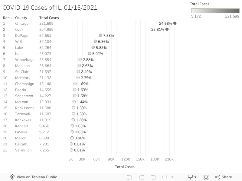
Task 4: COVID-19 Cases by County (Dot Chart)
The dot chart displays total COVID-19 cases for Illinois counties and the City of Chicago, with each geographic unit represented as a single point on a shared horizontal scale. This design allows for quick and direct comparison across counties. To improve readability and focus on meaningful patterns, the chart is filtered to include only counties with more than 5,000 cases. Applying this threshold reduces visual clutter and highlights counties with the highest case counts, making differences between counties easier to identify. Overall, the dot chart is effective for ranking and comparing case totals across many geographic units.
Task 5: COVID-19 Running Total by County (Waterfall Chart)
The waterfall chart illustrates how individual counties and the City of Chicago contribute to the cumulative total number of COVID-19 cases. Each county is added sequentially to a running total, allowing the viewer to see how larger contributors account for a significant share of total cases. A modified variable created by multiplying total cases by negative one enables each bar to visually connect to the previous level, producing the waterfall structure. As with the dot chart, the visualization is filtered to include only counties with more than 5,000 cases to maintain clarity. The final bar represents the grand total of cases for the counties shown.

Comparison of the Dot Chart and Waterfall Chart
The dot chart is particularly effective for comparison because all counties are displayed on the same scale, allowing differences in case counts to be identified quickly. It is simple, intuitive, and works well when many geographic units are included. However, it does not show how individual counties collectively contribute to the overall number of cases.
In contrast, the waterfall chart emphasizes cumulative contribution rather than direct comparison. It clearly demonstrates how high-case counties and the City of Chicago drive the overall total, making it useful for explaining impact and accumulation. A limitation of the waterfall chart is that it can become difficult to read when too many counties are included, which is why filtering is necessary. Together, these two charts show how different visualization techniques can complement each other by supporting both comparison and explanation of cumulative effects.
Overall, these visualizations show that chart choice should match the goal: the dot chart supports quick comparison, while the waterfall chart supports understanding cumulative impact.


Comments
Post a Comment