Lab 3 – 1
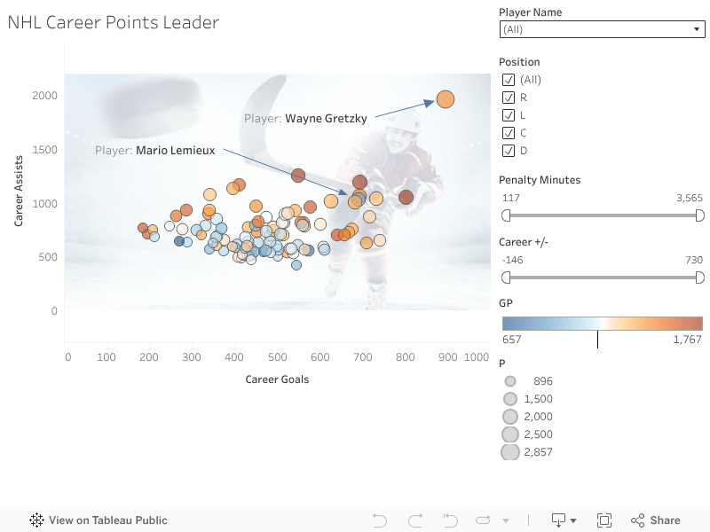
Task 1: NHL Career Points Leader
This scatterplot shows the relationship between NHL players’ career goals and career assists. Wayne Gretzky and Mario Lemieux are highlighted to emphasize how they stand out relative to other players in overall point production.
Task 2: Quadrant Chart of NHL Goals and Shots
This quadrant chart shows the relationship between NHL players’ career goals and total shots taken. Average reference lines divide the scatterplot into four quadrants, making it easier to compare player performance relative to league averages. The chart helps identify players with high scoring production, high scoring efficiency, and lower overall performance in a clear and intuitive way.

Comparison of Task 1 and Task 2 Visualizations
The scatterplot in Task 1 is most effective for exploring the data. It shows the relationship between two player statistics using one point per player, which makes it easy to see the overall pattern, clusters of typical players, and extreme outliers. For example, when you look at the scatterplot, you can quickly notice players who stand far away from the main group. This is helpful for an analytical purpose, such as asking questions like: “Who are the top performers?” “Are most players grouped together?” and “Is there a general relationship between the two variables?” Because it is open-ended and does not divide the chart into categories, the scatterplot works best for viewers who want to study the full distribution and interpret the pattern in their own way (for example, students, analysts, or people who are comfortable reading charts).
The quadrant chart in Task 2 is more effective for clear communication and quick comparison. It uses the same type of scatterplot, but it adds average reference lines that divide the view into four sections. This makes the message easier to understand for a broader audience because the viewer does not have to “guess” what counts as high or low. Instead, the chart clearly separates players who are above average and below average on each variable. With one glance, a general audience can understand who is in the “high production” area (high goals and high shots), who appears more “efficient” (higher goals with fewer shots), and who is below average on both measures. In other words, the quadrant chart reduces the effort needed to interpret the chart and helps the viewer make faster, more confident comparisons.
Overall, both charts communicate valuable information, but they serve different purposes and audiences. The scatterplot is better when the purpose is exploration and discovery, especially for an analytical audience that wants to examine details, identify outliers, and look for trends without being limited by categories. The quadrant chart is better when the purpose is communication and explanation, especially for a general audience that needs a clear structure and quick takeaways. By adding the quadrant lines, Task 2 turns the scatterplot into a more guided message, which makes it easier to communicate performance differences in a simple and direct way.


Comments
Post a Comment