Lab 2 – 1
This section presents Tasks 1–3 from Lab 2, based on Chapters 4 and 6 of Communicating Data with Tableau. These tasks use ratios, ranking, and distribution-based visualizations to examine recycling behavior and refuse production across New York City community districts and boroughs. The visualizations follow examples from the textbook and are implemented using Tableau.
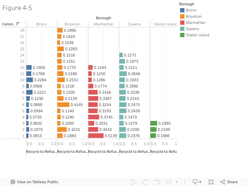
Task 1: Ratio of Recycling to Refuse by Community District
The data show recycling and refuse collection for New York City community districts, organized by borough. By expressing this information as a recycle-to-refuse ratio, the chart allows districts of different sizes to be compared fairly. The pattern shows that recycling performance varies across boroughs and also among districts within the same borough, revealing spatial differences that are not clear from total amounts alone.
Task 2: Ranked Recycling to Refuse Ratio
This view uses the same recycling and refuse data but orders community districts from highest to lowest recycle-to-refuse ratio. Sorting the districts makes it easier to see which areas perform better or worse relative to others and helps highlight outliers. Ranking supports quicker comparison than the grouped bar chart when many districts are included.

Task 3: Refuse Production per Person (Box Plot)
This chart is based on refuse collection data combined with population data to calculate refuse produced per person. The box plot summarizes how refuse production varies across boroughs by showing typical values and the spread of community districts within each borough. This makes it easier to compare overall patterns and variability rather than focusing on individual districts.

Discussion
The three visualizations reveal different but complementary insights about waste patterns in New York City. The ratio and ranked bar charts emphasize differences between community districts by highlighting relative recycling performance, making it easy to identify high- and low-performing areas. In contrast, the box plot shifts the focus from individual districts to borough-level patterns, showing how refuse production per person varies in terms of both typical values and spread. While the bar charts are effective for comparing specific districts, the box plot better summarizes overall distribution and variability, allowing broader comparison across boroughs. Together, these charts show that recycling efficiency and refuse production are unevenly distributed across the city and that different chart types are needed to understand both detail and overall patterns.


Comments
Post a Comment